U1LA3.1: Layout with CSS Grid

How can I structure the content/elements on my HTML page using CSS grids?

Teacher Notes && Overview

In this lesson, students will begin working with CSS grids to organize the elements (and the content they contain) in their HTML page onto a grid template. They will begin with a code-along to get a sense of how elements are assigned to different grid areas. They will then build CSS grids that meet certain specifications based on visual models of increasing complexity. Time permitting, students will create their own grid designs according to their learning needs and readiness to experiment.

Objectives

Students will be able to:

  • Create a grid layout with multiple columns and rows using the grid-template-columns and grid-template-rows properties

  • Place specific items on specific areas of the grid using the grid-template-areas (on parent element) and grid-area (on children elements) properties

Suggested Duration

2 Class Periods (~90 min)

NYS Standards

9-12.DL.1 Type proficiently on a keyboard.

9-12.DL.2 Communicate and work collaboratively with others using digital tools to support individual learning and contribute to the learning of others.

9-12.DL.5 Transfer knowledge of technology in order to use new and emerging technologies on multiple platforms.

Vocabulary

  • grid: a two-dimensional layout with rows and columns

  • grid container: the direct parent element of all grid items; any element can be a parent element as long as the CSS property and value display: grid || display: inline-grid are applied

  • grid item(s): the direct child(ren) element(s) of a grid container

  • grid line: dividing lines that make up the structure of the grid that can be styled using the gap property

  • grid area: any continuous space within the grid; can span multiple columns and rows

  • grid parent properties: CSS properties that are applied to the parent element when creating a grid; common examples include: display , grid-template-columns , grid-template-rows , and grid-template-areas

  • grid child properties: CSS properties that are applied to the grid items/ child elements contained within the grid parent; common examples include: grid-area , grid-column-start , grid-column-end , grid-row-start , grid-row-end

NB: Many students will benefit from visualizations of the above terms. You can find great visual representations of many of the above terms in the Important CSS Grid Terminology section of the A Complete Guide to CSS Grid resource. Students might also find the illustrations included in the FreeCodeCamp Grid Tutorial with Cheatsheet helpful.

Planning Notes && Materials

Suggestions for UDL

Coming Soon

Suggestions for Differentiation

For students who are struggling to conceptually grasp what grids “look” like and how they relate to items, they might benefit from working with labeled physical representations of grids that they can manipulate and place grid-items on. This can also be achieved using a digital resource; choose what makes most sense for your students.

Resources

Assessments

Formative:

  • Frame the image

Summative:

  • Upcoming CSS Grid Lab

Do Now/Warm-Up (~5 min)

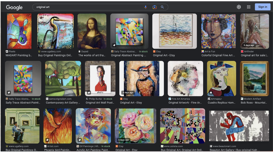
Grab a computer and do an image search for anything school appropriate you are interested in. Be sure to click on “image” at the top so you get a page of image results only. What do you notice about the way the images are organized on the screen? How might you go about organizing elements of your HTML file to create this kind of pattern?

Next, take a look at the layouts on these three websites. What do you notice about the layouts? What about each of these makes the page an example of good (or bad!) design?

NB: If students are not mentioning it already, try to nudge their attention toward the apparent rows and columns in the Google image results or in the sample websites above, especially 2 and 3.

Introducing CSS Grid (~2-5 min)

In prior lessons, we have learned that HTML pages use a nested structure with parent elements that contain children elements. We are going to be building on this understanding today, so let’s take a minute to review some code structuring a very basic home page. In this example, the <body> element is the parent to three ‘children’ elements: <header>, <main>, and <footer>. As soon as we put one or more elements inside the <header>, <main>, or <footer>elements they will become parent elements to whichever elements are nested within them.

Code Along: Building a Grid with CSS (15-20 min)

Now that we have the parent-child nesting structure in HTML clear in our minds, we are going to learn how to leverage that structure to create CSS Grid layouts that will help us structure our pages in all kinds of cool ways. What is CSS Grid (layout)? In a nutshell, we can use CSS to create table-like layouts of columns and rows that we can then place ‘items’ on to create a specific layout. Check out the following basic example of a layout you might create using an underlying grid structure:

Let’s build this example together! Open up the Code Along Exemplar Code (repl.it | github). We can see that there are four elements ‘contained’ in this grid. These are called grid-items. They are children elements to the grid-container, which in this case is the <body> element. Check out the HTML below, which does not yet have any CSS styling added. It’s our starting point for building the above grid layout.

<body class="grid-container">
    <header class="grid-item">Header</header>
    <main class="grid-item">Main</main>
    <sidebar class-"grid-item">Sidebar</sidebar>
    <footer class="grid-item">Footer</footer>
</body>

Without any CSS applied, this HTML produces very boring output! (Try it!)

In order to replicate the layout we see in the image above, we are going to begin by using the following CSS grid parent properties, which we will assign to the <body> element: display, grid-template-columns, grid-template-rows, and grid-template-areas.

First, we need to use the display: grid property and value on the <body> selector of our CSS page. This lets the computer know that we are going to be building a grid layout. Next, we need to decide how many columns we want our grid to have. Since we are creating a replica of the image above, we are going to give our grid four columns. To do this, we use the grid-template-columns property on the parent element (<body>). This is what our CSS file should look like so far:

html{
    height: 100%;
    width: 100%;
}

body{
    display: grid;
    grid-template-columns: 1fr 1fr 1fr 1fr;
}

How has the output changed? Click on the new tab icon to the right of the wrench on your repl to view your page on a tab and outside of the repl.it editor.

Once you are there, right click on the page and choose “inspect” from the menu. Notice, that alongside the <body> element, it is labeled “grid”.

Hover over the grid with your cursor and notice what is highlighted on the page. Can you see the four columns we just created? What do you notice about the columns? Go back to your CSS page and add the following property and value to the <body> selector: height: 101vh. Refresh the inspect view and see what has changed when you hover over the “grid” alongside the closing </body> tag. (By adding the height property with the value 100vh, we are telling the browser to stretch our grid to fill the entire “view height” of whatever device is being used; this is why the rows are stretched making the grid larger.) How many columns does our grid have? How many rows?

Since we have only two rows (by default) in our grid, we need to override the default by using the grid-template-rows property. Since we want three rows, we will follow the same pattern with our values using “1fr” three times OR we can use the repeat function and simplify our code like this: grid-template-rows: repeat(3, 1fr); Refresh your inspect page and hover over the “grid” to see what your grid looks like now. It should look like this!

At this point, you might be wondering what this “1fr” is. This stands for “fractional unit” and if you use it in a CSS grid to create X number of columns or Y number of rows, it will make those columns/ rows an equal size. You can use other units to define the shape of your grid.

OPTIONAL: Take a few minutes to experiment with using different units to define your columns and rows in the grid. Try plugging in some of these examples: 200px auto 15em 1fr. Experiment with shrinking and expanding the window after you change from 1fr to the other units? What do you notice? You might also want to experiment with using the repeat function!

NB: The Grid Attack! Game provides lots of exposure to using different units of measurement as values for the properties grid-template-columns and grid-template-rows and will help students build a deeper visual and conceptual understanding of grids. And, it's fun! If you feel students need more practice, feel free to pause or extend to give playtime with the game.

We are going to add one more property to our parent element that might seem a bit tricky at first! This property, grid-template-areas, is a map that will show which part of the grid specific items will populate. Since our grid has four columns and four rows, our template must have a value/ variable representing each cell of the grid that links it to the grid item we want to place there. Let’s look at this generic example first to see the syntax - within the body selector, let's add:

grid-template-areas:
"item item item item"

Now, let’s look back at the layout we want to replicate (scroll up!). We can see from our model that we want the entire top row to contain our header. For code readability sake, let’s replace all of the “item” variables in the top row with the word “header”. Now, we need to link this to the <header> child element in our CSS by using the <header> selector and the grid child property grid-area. Youc an also add some border styling so you can see how the item is being positioned on the grid. Like this:

header{
    grid-area: header;
    border: 2px solid purple;
}

You might notice some weirdness when you run your code and inspect the grid. If you are seeing everything scrunched up in one corner, check your parent element properties and values and make sure that each is following correct syntax. Look for any missing semicolons! If you are NOT seeing everything scrunched up at the top, that’s great BUT we still have work to do! Continue following this pattern to map out where the <main>, <sidebar>, and <footer> items will be placed. Be sur eto add selectors for each and style with the grid-area and (optionally) the border property.

Once you have an output that looks something like this:

Use the W3 schools documentation or general Googling to figure out how you can use the text-align, background-color, and border-radius properties to style your output so it is a more accurate replica of the model. Have fun exploring the documentation and the resources linked above to experiment with other properties to style your grid. You can also use what you have learned in previous classes about custom fonts to further style your output!

Frame an Image with CSS Grid: Intro (10 - 15 min)

A lot of websites use a CSS Grid layout to structure the main elements of the landing page, like we did with the header , main, sidebar, and footer elements in our first example. You have learned one way to set up a grid! We can use grids anywhere on our webpages and we can approach building them in different ways.

In this project, you are going to learn how to use the grid line numbers to tell the computer where to place each element by using the following properties on the children elements in the grid: grid-column-start, grid-column-end, grid-row-start, and grid-row-end and the shorthand versions: grid-column and grid-row to create a frame around an image.

This time around, we are going to use <div> elements to build our grid, which is already set up in the starter code. Open up the starter code and notice that the current output is what you see below. We are going to rearrange the items in the grid so that it matches the final output, also displayed below. Of course, you can spice it up by further styling the elements once you have the grid layout figured out!

Let’s get started! First, take note that the starter code already includes some really helpful lines of code! Take some time to look at the <div> elements and their class names. What do you notice? Click over to the CSS file and poke through what is there. Notice that the parent <div> has the name container and the elements nested within that parent <div> each have two class names, one they share in common (item) and one that is unique. Any styling changes we want to make to all children of the parent <div> we can attach to the .item selector, as you can see in the starter code. For styling changes to a specific <div> child element, we would use the item-# (whichevrer number) class name.

<div class="container">
    <div class="item item-1">This</div>
    <div class="item item-2">Is</div>
    <div class="item item-3">My</div>
    <div class="item item-4">Layout</div>
    <div class="item item-5"><img src="escher_image.jpeg" alt="MS Escher artwork of a hand holding up a reflective globe that contains an image of the man holding up the reflective globe">
    </div>
</div>
.container {
    display: grid;
    grid-template-columns: repeat(4, 1fr);
    grid-template-rows: repeat(4, 150px);
    gap: 5px;
    height: 100vh;
}

.item{
    height: 100%;
    text-align: center;
    border: 2px solid black;
}

Now, open the new tab view and right click to inspect the source code. As before, click on the grid oval alongside the <div> container and you should see a grid like the one below with numbers labeling the various grid lines marking the start of specific rows and columns. This is really important! We are going to use these numbers to place specific elements on the grid precisely where we want them.

Notice in the starter code that the .item-1 selector has two properties but no values. Try plugging in some numbers between one and five and notice how the output changes. For example, try:

  • grid-column-start: 1;

  • grid-column-end: 2;

Try some different values and take note of what changes. Experiment until you figure out how to stretch .item-1 across the entire first row.

Good news! There’s a shortcut! Each time you want to indicate the start and end of a placement on a column or row, you can use one of the shorthand properties. This is how it works:

Activity (~20-30 min)

Now that you know a bit about how these properties work, add CSS properties to the children elements to frame the image. Once you have placed each of these elements in the correct area, use the documentation, other resources shared above and general Googling to style your frame! You might also want to dig into the A Complete Guide to CSS Grid resource to try out additional properties, explore sizing keywords and functions or to learn how to build sub-grids!

Wrap-Up (~5 min)

Ask students to discuss or capture the answers to the following in a post-it note check-in or similar exit slip.

  1. We learned two approaches for placing elements on a grid: A) using the grid-template-areas property on the parent element selector and the grid-area property on the children element selectors; and B) using the grid-column-start, grid-column-end, grid-row-start, and grid-row-end properties on the children element selectors. Which approach do you prefer and why?

  2. What do you find the most satisfying about building grid layouts in CSS? What do you find most challenging?

Extensions

This lesson can be very self extending - can students create a more complicated grid, or several framed grid images on a single page?

Last updated