U3LA3.3: Fonts && Text Styling
How can I use custom fonts and text to enhance my programs?
Teacher Notes && Overview
In this learning activity, students draw text with different fonts (both system fonts and custom ones), manipulating their placement, size, and color.
The only new code introduced in this lesson are commands that control text styling - everything else is really about using custom fonts, which involves a little hopping in and out of the HTML. It's VERY IMPORTANT, as with images, that students are extra mindful of making sure they type (and capitalize, and space) everything correctly in their font names, as this is a common way that students will run into errors.
There is an option to teach students how to use downloaded fonts, as opposed to relying on the options on the Google Fonts website. If this appeals to you, be sure to test downloading and using a font ahead of delivering that portion of the lesson.
This is a really fun time for kids, so enjoy it!
Objectives
Students will be able to...
Apply basic typographic principles when adding text to their programs
Add custom fonts from websites like Google Fonts to their programs
Create and style text in p5.js
Suggested Duration
1 - 2 Periods (~45 - 90 minutes)
NYS Standards
9-12.CT.4 Implement a program using a combination of student-defined and third-party functions to organize the computation.
9-12.CT.7 Design or remix a program that utilizes a data structure to maintain changes to related pieces of data.
9-12.DL.1 Type proficiently on a keyboard.
9-12.DL.2 Communicate and work collaboratively with others using digital tools to support individual learning and contribute to the learning of others.
Vocabulary
Font: A font is a set of printable or displayable text characters in a specific style and size.
Typeface: a particular design of type/a font.
Serif: Serifs are semi-structural details or small decorative flourishes on the ends of some of the strokes that make up letters and symbols. An example would be the Times New Roman font.
Sans-serif: Sans serif does not have these details or flourishes. An example would be the Arial font.
Resources
Finding and Adding Fonts (Youtube Video)
Using Custom Fonts (Youtube Video)
What is HTML and CSS? (4 min video)
Papyrus (SNL Skit)
The Rise and Fall of Comic Sans (3 min video)
Do Now/Warm Up (3-5 minutes)
Ask students to explain:
How would you react to seeing each of these signs in the wild? Which do you think would be most likely to elicit the intended response of stopping? Why?
Text & Fonts in p5.js (7 -12 minutes)
As we've seen, we can create text using the text()
function. It must be given a string (the text it will display) as well as an x and y location for the text. (There are other optional values that will allow you to create a 'box' that the text will wrap in, kind of like how text naturally drops to the next line when you are typing in the editor or a word processor.)
But there is a lot more to text, including a lot of things students have probably been asking about - you can change the size, the color (both stroke
and fill
, just like with shapes), and the font which we know has been something that everyone has been waiting for!
We've been saving fonts because in the world of design - and p5 - there is a lot to know about them, and we want to make sure that y'all have that down before we start playing.
Not all Fonts Are Created Equal
First, let's review some background on fonts before we get into it on the computer. Although there are all kinds of crazy fonts out there - fonts that look like handwriting, fonts that look like big boxy letters - the readable fonts you would typically type large chunks of text in fall into two main categories:
'Serif' fonts just have that little extra foot on the letters, highlighted in red, and 'sans' or 'sans serif' fonts do not. (Sans is an old French and middle English word that literally means 'without.') As we start to take a look at fonts online, you will see that they are broken down into these categories.
There are so many other issues that typographers and designers are concerned with when they add text to projects. These are not issues we will be focusing on in this lesson, but it is worth noting that things like the space between characters (kerning), the maximum height of characters, and even the angle of certain parts of the letters are all things professional designers think about.
While we won't go too deep into all of that - which would be a class all on its own - we will keep a few things in the back of our mind as general rules for working with type:
Keep the number of fonts used to a minimum.
Big chunks of text should be in standard fonts (a serif or sans-serif).
Limit line length.
Make sure your typeface looks good in various sizes!
Use fonts with distinguishable letters.
AVOID ALL CAPS EVERYTHING, IT IS ANNOYING AND LOSES IMPACT.
Don’t minimize spacing between lines of text.
Make sure you have sufficient color contrast if you expect something to be readable.
Avoid coloring text in red and green (because of color blindness - there are actually many types of color blindness, but this is most common. You can learn more here!)
Avoid using blinking text when possible (so you don’t trigger seizures)
It’s also worth knowing that some fonts come with a lot of baggage from the design community - fonts like Papyrus and Comic Sans give people a lot of strong feelings! Tread carefully if you choose to use them. Teachers, feel free to use the videos below to take a silly moment before you dive into the code explanations, or skip if you do not feel they would land well with your class:
Papyrus (SNL Skit)
The Rise and Fall of Comic Sans (3 min video)
Use a Web Font (7-12 minutes)
Fonts on the web are downloaded from a server upon request. There are some fonts that all computers know and can access easily; common examples are "Arial", “Courier,” “Courier New,” “Georgia,” “Helvetica,” “Palatino,” “Times New Roman,” “Trebuchet MS,” and “Verdana”. Other fonts, computers need to be pointed towards either by having the downloaded font as part of our project, or by linking to the location of the font in our HTML.
Many options for finding fonts are available, often for free, on websites like Google Fonts and Open Font library.
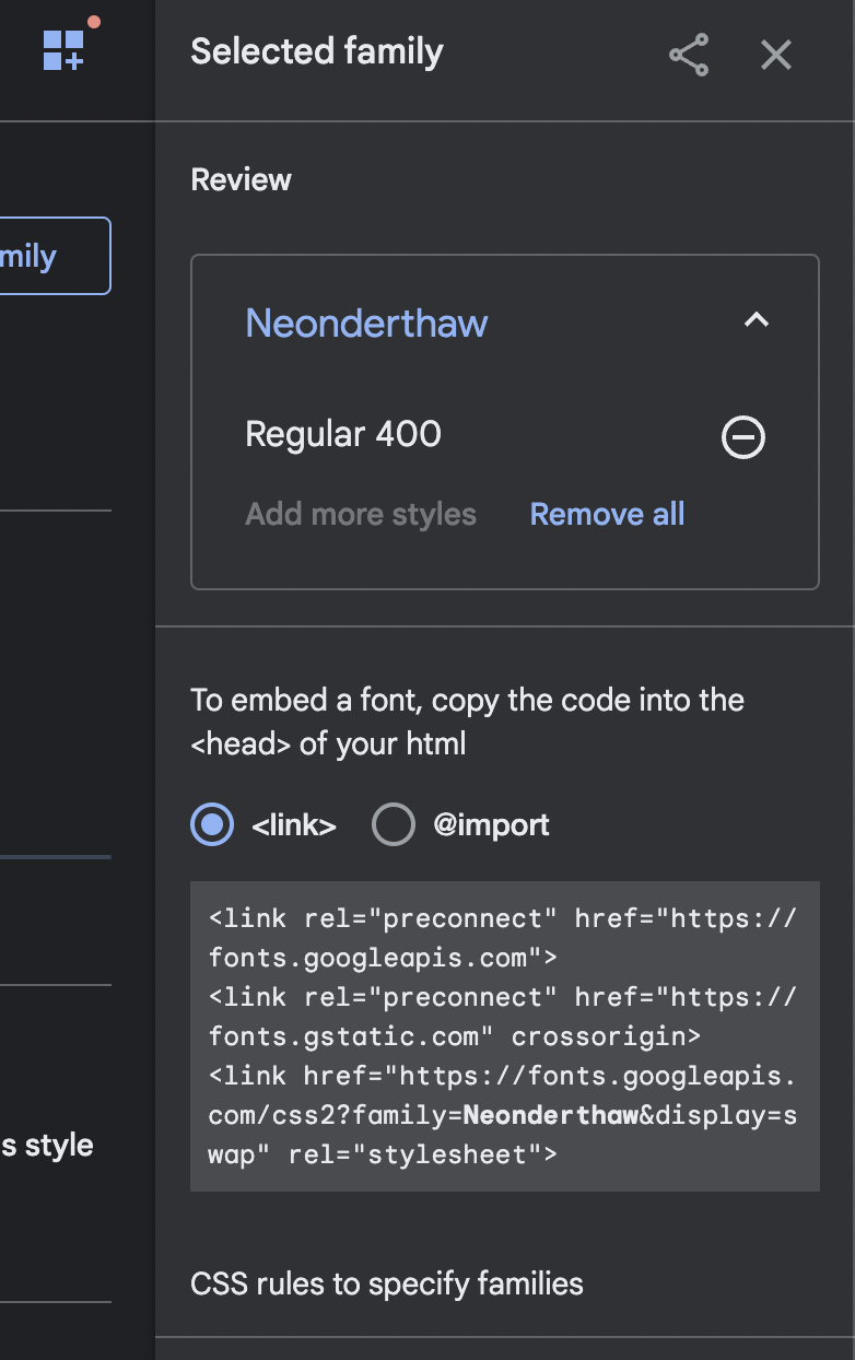
In Google Fonts, you will need to click the fonts you would like (note that you can search by different categories or font names, and once you view a font you can retype the sample text to preview) and then click +Select Font Family. You can select one or multiple fonts at a time, but they will all show up in a selected fonts side panel. Once you've selected your font, you want to EMBED the font in the HTML using a code snippet that looks like this (font names will vary based on selection):
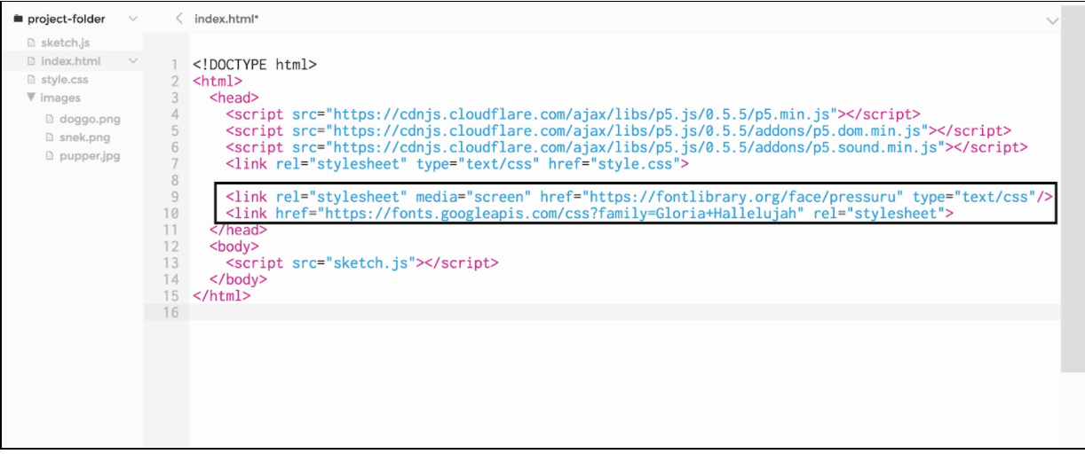
We then paste the embed link into the head section of our sketches' index.html file:
From there, we can use this font in our code like so:
(NB: we also changed the size of our text. This is VERY similar to how you change font sizes when writing in Google Docs/Slides/etc! textSize() uses pixels as the unit size. We could, if we wanted to, also change the stroke and fill of our text just the way we do with shapes, but note that not every font has a stroke, and not every font has a fill. You may need to experiment!)
[OPTIONAL] Use a Downloaded Font
NOTE: It is perfectly okay to skip doing this section full-class and instead save it on a need-to-know basis if kids find fonts they would like to download. In fact, it's what many teachers choose to do to avoid extra chaos when learning new skills!
Maybe the sites that host web fonts don’t have what you’re looking for - that’s okay! You can download font files directly to your computer and upload them into your program so they can be used and seen everywhere.
The steps to include a downloaded font in our sketch are similar to those we took to include an image in the previous learning activity. We copy the file into our sketch folder (p5 supports the TTF and OTF file formats), load it into a variable preload using loadFont, and then set our text to it using textFont.
Practice: Build Your Font Library! (10 - 20 minutes)
Open this starter code (p5 editor | repl.it) of boring sentences that you will be styling. Before you can begin, you will need to build your font library. Go forth onto Google Fonts (or Open Font Library) and find the following to add to your program and slide into that array:
3 Serif Fonts
3 Sans Serif Fonts
2 Display Fonts
2 Handwriting Fonts
Then, give each sentence:
It's on unique font
A specific size
A fill/stroke color.
Extension
The extension options here are all extras that students can choose to engage with if they wish (or that you can integrate to extend the lesson):
Using line breaks: including \n within a string (like "hello\nworld") will insert a line break. See if you can break up the sentences in interesting ways without using a second text() call!
Define boxes for text: We can constrain a text to be drawn within a box by adding x, y, width, and height parameters to the call to text:
Last updated